Messy Excel in.
Your network: see it, cost it, optimize it.
Built for logistics analysis.
MapVisualizer does the unbillable hours — the geocoding, the cleanup, the map. Then the part that matters: measure what the network costs, compare scenarios, and optimize where each facility should sit. Minutes, not days.
The first days of every engagement go to fighting data, not finding insights.
The customer hands over the data. It's messy — inconsistent labels, missing coordinates, structures that never quite match what was promised. Hours disappear into cleanup, address matching, and geocoding before anything useful appears on screen.
Then comes the part that matters: exploring the network, spotting the patterns, framing what you bring to the table. By then, half the time is gone.
Generic BI tools weren't built for this. Enterprise network design suites cost €50,000 and take weeks to learn. Most consultants end up stitching together Excel, Google Maps, and PowerPoint — making the puzzle work, but losing the time it costs.
MapVisualizer replaces the puzzle with one uninterrupted session:
Messy Excel data
AI normalization &
three-stage geocoding
Map visualizations
Measure the cost
Optimize & export
Six things this tool does, shaped by thirty years of doing the work.
Every default, every analysis method, every piece of vocabulary is shaped by experience inside the work — not bolted on from the outside. The features are the ones consultants actually need; the rest, deliberately not here.
Any address, sorted automatically.
A three-stage pipeline normalizes, geocodes, and falls back to place search. Resilient on the messy real-world data smaller tools choke on.
Your client's brand, exactly.
Atomic color control — every circle, every bar, every line, individually. Custom basemaps, opacity, decoration. Your map walks into the steering committee looking like their map, not a generic SaaS export.
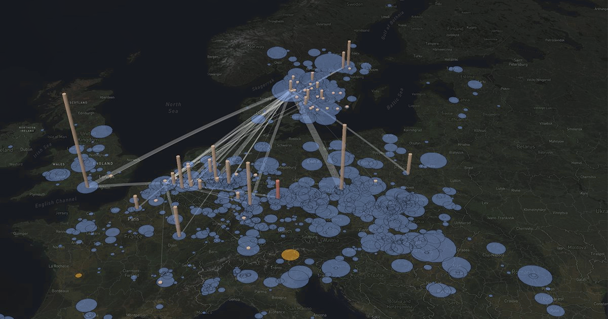
Three dimensions, on purpose.
Extruded volume bars, animated geodesic flows, tilt-to-explore. Volume becomes obvious in a way no flat dot-map can show — and no slide deck can fake.
Optimize the whole network.
Place N facilities for lowest cost — center of gravity or lowest-cost placement — and move any site to its cheapest spot. Route flows through cross-docks to cut cost, too — the network, optimized end to end.
What the network actually costs.
Cost every flow against real tariffs, the built-in Europe road benchmark, or real road distances — or model the real truck tours it takes to run it. Save scenarios, compare them, and see the difference — the number that turns a map into a decision.
Excel in. Excel out.
Any Excel structure works as input — column mapping is automatic. Export the enriched dataset back — normalized addresses, coordinates, costs — as the deliverable, and it re-imports clean.
Thirty years in logistics, and I still spent the first days of every project cleaning data instead of doing the work. I built the tool I always wished I'd had.
Seven years in strategic logistics at Volvo Cars, designing the company's logistics network strategy. Twice reached the finals of the Volvo Cars Technology and Innovation Award — the company-wide R&D recognition, where logistics submissions competed alongside the entire engineering organization. Before that, founder of Proxio AB, winner of the Grand Logistics & Transportation award for "Innovation of the Year," with ABB, Schenker, PostNord, ICA, and Sandvik as customers. Currently Product Owner of BI and Analytics at Stena Recycling Group.
→ Connect on LinkedIn